Books
Look at the Beautiful Cover
Look at the Beautiful Cover #9
12/17/2015
Hello and welcome to another edition to Look at the Beautiful Cover! I have a huge collection of recent cover reveals going back to October. Yes, a lot of great covers have debuted since then and I am super excited to talk about them. Some books I am in huge anticipation, some books I did not like the cover too that much. Nevertheless, I am looking forward to reading all these books and I hope you find new ones! Now, to the covers and thoughts! (Click the covers to be taken to their Goodreads pages!)
---
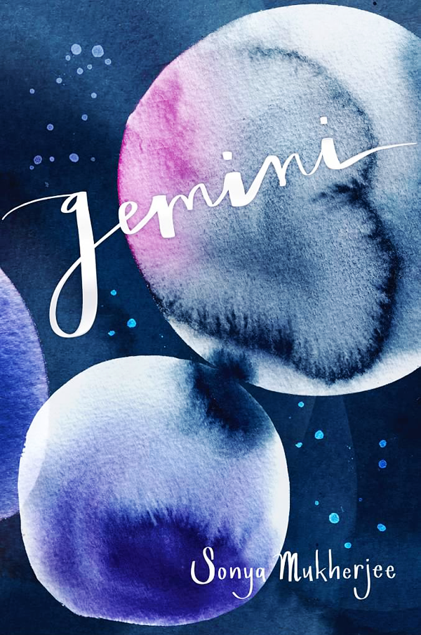
Gemini
 |
| Original Reveal |
This cover is absolutely gorgeous and I love love it. The typography is just beautiful and I love the cursive "Gemini" and the beautiful color scheme! Super excited about this book and I cannot wait to read this book and hold it's beautifulness as well.
~
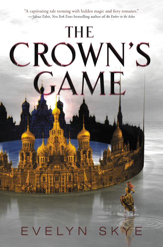
The Crown's Game
 |
| Original Reveal |
Ever since I heard Evelyn was writing a book, it has been on my radar for so long and I am so excited to be talking about her cover. It's seems like such a great read and super excited for the characters. The cover, to be honest, isn't my favorite. I mean, I like the girl walking towards the crown but the Crown itself with it kind of taking shape as the castle/ building (Whatever it is) is not something I am very font of? Also, the title font isn't my favorite as well. Nevertheless, even if I don't agree with the cover, I am still planning to read this book.
~
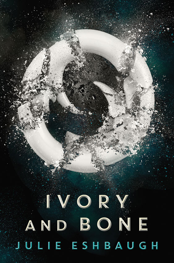
Ivory and Bone
 |
| Original Reveal |
This is a cover I like. The color scheme? Love! I love how the fonts on this cover are so simple so it doesn't take out from the focus in this cover, the beautiful breaking bone. I love how detailed it is: How you can see the cracks and the pieces coming off of it as well. All against a black background? Love!! Plus, it all goes perfectly with the title!
~
Outrun the Moon
| Original Reveal |
I was so excited about this cover debuting because it's another Stacey Lee novel and I adore her. I am so excited to freaking finally read this book (Yay ARCs!) and experience the greatness. It's not everyday I read a historical fiction and I tend to stay away from those but I am always in a mood for a Stacey Lee novel. Okay, so the cover! I honestly love it. There is such a great balance between how much attention the title has but also the lantern below it. I love how this cover shows the lantern's glass mid-shatter and also, the smoke coming off the candle in the lantern? The black smoke rising from the candle? The lanterns blowing the background? SO DRAMATIC EVERYTHING ON THIS COVER IS SO DRAMATIC!! I love it and it makes me super excited for the book.
~
The Star Touched Queen
 |
| Original Reveal |
Ohhhh I do like this cover. Really excited to read this book and the cover is just great. The placement and layout of the words in the title are a bit awkward but other than that I do love this cover. The dramatic clock as the girl looks over at a castle building thing in the distance. Just beautiful. And I also love how the top of the cover has this orange to it while the girl is kind of standing on the blue stuff (What is that? The sky? Are stars teal?). The border going around the book is really pretty as well and I love the garnishes at the corner.
~
Elementals
 |
| Original Reveal |
Uhhhh okay so this cover definitely isn't a favorite of mine. I mean I just am not a fan of the girl in the background and the magical particles that floating around her. I just find the girl really awkward in the background of the cover as well. Also, not very keen of the font used for "Elementals." Overall, this cover wasn't the best I have ever seen but I definitely hope to read Elementals soon as I do enjoy reading Michelle's works!
~
Stars Above
 |
| Original Reveal |
I love how consistent they have kept the Lunar Chronicles with their covers and this is another I really like. This book is a collection of novellas and I am pretty excited for this book. Have yet to read Winter but I definitely will be soon! I love how they used a crown as it's main object for this cover because, well all the characters are really basically all fighting for the crown! The crown is actually really pretty and I am very happy with this cover!
~
Ever the Haunted
 |
| Original Reveal |
Ugghhh this cover is sooo pretty. The beautiful swirls going on around in the background are just beautiful. The font used for the title and how it is all arranged is just beautiful and I love it's gold touch to it as well. The banners going behind "Erin Summerill" and "Ever the Outcast. Ever the Brave" give the cover such an elegant and kingdom like touch I love it. The bow and arrow going under the title and how the arrow points right towards the antlers? Love! So much going on but it definitely is a controlled beautiful chaos.


0 comments