Books
Look at the Beautiful Cover
Look at the Beautiful Cover #10
3/05/2016
Hey! Hello! So, things have been pretty exciting around in the book publishing world and lot's of covers have been revealed. Today, I am here to talk about the few covers that have recently been released and my thoughts on them. I hope you enjoy the post and have fun looking at some of the covers I have today!
~
Illusion
 |
| Original Reveal |
I am pretty excited about this book! It's the last book of this series I believe so it is all going to be a bittersweet experience for me reading this final book. But, the cover is beautiful. I really love how consistent the whole series is with their covers when it comes to the typography. I love the light swirls that go around the title and how it compliments the title. The one thing that could have made the covers more uniform: if the background pictures of the cover kept the same concept. Two people in the background and they're embracing in some way. It's all good though! I love this cover and really appreciate it's similarities with the other covers.
~
Crooked Kingdoms
| Original Reveal |
AHHHH! This is a super exciting cover reveal because that means we're just one step closer to Crooked Kingdom! I loooved Six of Crows and I am so excited for the new sequel. This cover? Love. Again, the cover is similar to Six of Crows' cover and I appreciate the fact that these two beauties will be sitting on my shelf and lookn' pretty as they compliment each other. I love how in this cover, we see more of the crow and its wings. I also love how the sky in the background it kind of like a dusty tan and the whole overall dark vibe the whole cover gives off.
~
Gemina
 |
| Original Reveal |
Illuminae killed me because it was so good, I loved the characters, and the ending was just fabulous. The first thoughts I had when I saw this cover was "WOAH BLUE!." It is definitely pretty different from Illuminae's cover but I do like how they kept the scribble like thing in the background. I am looking forward to the words popping out through the dust jacket because it honestly looks great with that. The blue background itself? I'm not the biggest fan of the shade of blue. It's pretty, but I don't like it very much... It probably will look better once the cover on a physical book (hopefully.)
~
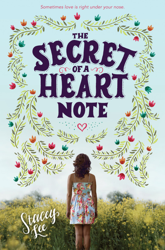
The Secret of a Heart Note
 |
| Original Reveal |
Yissss Stacey Lee more beautifulness. I am so in love with this cover, I really am. It is super different from the covers of Stacey's other books but hey! New publisher, new cover styles! THE TYPOGRAPHY IN THIS COVER IS JUST OMG. I love the font "Stacey Lee" was written in and the title fonts (which reminds me of My True Love Gave to Me's title) is just so beautiful. The color and leaf border embellishment is gorgeous and I love how it leads and ends with the girl standing there. The whole color scheme and how the colors of the whole cover is just beautiful. Also, when I looked at the cover again, THE TAGLINE GOT ME. This whole book has something to do with smelling and that tagline was such a (good) pun.
~
United
 |
| Original Reveal |
I am really excited to read about the ending of this trilogy, definitely going to be a bittersweet one. The Alienated trilogy is sooo good and I am looking forward to reading about more Cara and Aelyx. But thiiiis is probably my least favorite cover out of this series. There are sooo many things that bother me, unfortunately. The other two were great but this one is just...*cringes.* The first thing I noticed when I saw this cover was the way that the orange and purple clash against each other. THEN (Oh I am not done yet) what bugs me the most was how the "t" is moved down just a bit in order for it to fit cover-Aelyx's hand. I know that was what had needed to be done but still, I can't get over it. And the blueness in the letters "un?" Yeah, that does not work out for me. Bummed this cover isn't as good looking as I hoped it was going to be but I am excited for the book nevertheless!


0 comments